InfoSight![]() is Nimble Storage’s “predictive analytics engine”. InfoSight is a SaaS support and monitoring portal provided by Nimble Storage for all customers. InfoSight collects and analyzes sensor data points from every single array. In fact, every four hours InfoSight collects and analyzes more sensor data points than there are stars in our galaxy.
is Nimble Storage’s “predictive analytics engine”. InfoSight is a SaaS support and monitoring portal provided by Nimble Storage for all customers. InfoSight collects and analyzes sensor data points from every single array. In fact, every four hours InfoSight collects and analyzes more sensor data points than there are stars in our galaxy.
What does all of this collected data provide?
- 9 out of 10 problems are automatically detected with prescriptive guidance on how to resolve them.
- Nimble Storage can measure uptime across all deployed arrays (not some cheesy lab test).
- By the way, that is >99.9997% uptime across the entire customer base! (at time of writing).
- InfoSight’s automation removes the pain of dealing with level-1 and level-2 support issues.
- When you have an issue, you go directly to a level-3 engineer (these are not outsourced support guys and gals! I cannot attest enough how much better this has been than dealing with [insert major vendor] where you historically have to spend three days troubleshooting your problem just to get to a support technician based in the US!)
I will save the rest of my commentary for another time, as that is not the topic of this post …
InfoSight Overview
Open a modern web browser and navigate to http://infosight.nimblestorage.com. Enter your username and password into the login form. (Your Nimble Storage partner should have helped you register with InfoSight during deployment.)
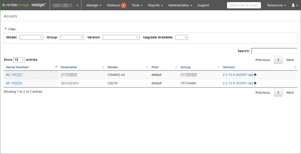
You are presented with the Assets page following successful authentication. Here we can see our active storage arrays by name, serial number, model, group, and version.
Selecting an array serial number takes you to the asset’s Overview. We can see the array model (CS440G-X4 with two expansion shelves in this example) and software version.
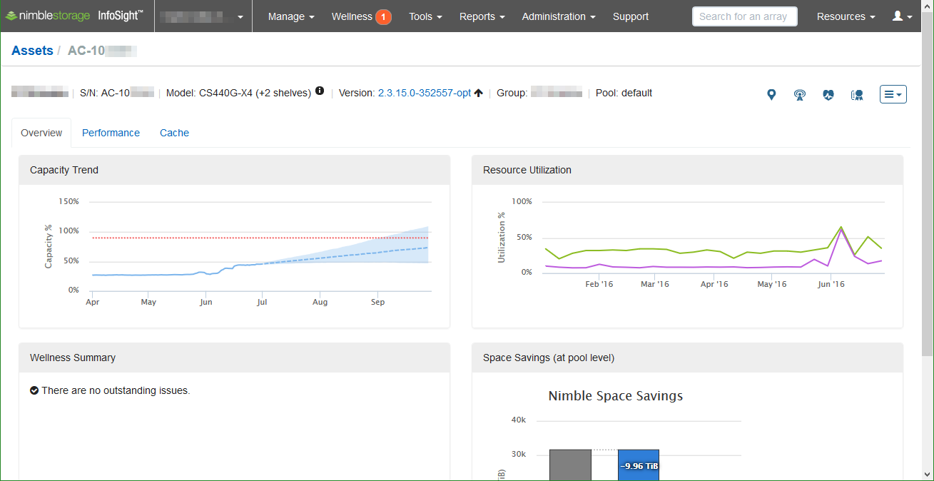
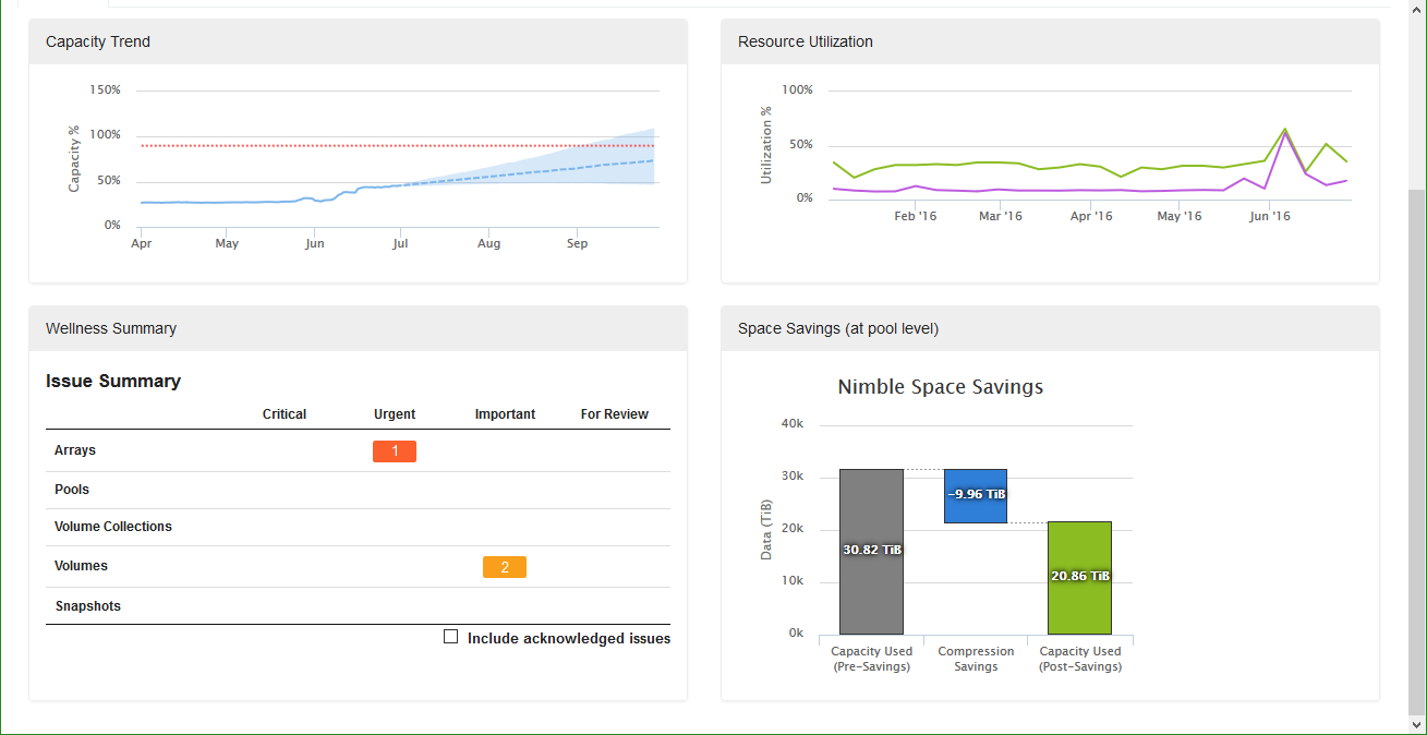
The Overview page also provides us with … an overview of the storage array; capacity trending and forecasting, resource utilization, a wellness summary, and a peak at the space savings.
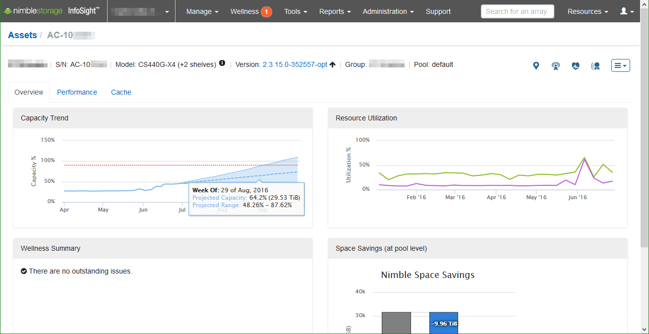
Hovering the cursor over the graphs provide more detail. Moving the cursor over the Capacity Trend graph displays the date on the timeline and the projected capacity based on our recent capacity trend. A projected range based on the recent trends provides top and bottom values. (A more stable trend results in a much smaller projected range; however, large fluctuations in capacity usage recently can result in a larger project range.)
The Resource Utilization graph provides insight into the historical usage of the storage controllers’ CPU and array’s read cache (CS-series arrays). This graph is great for monitoring the utilization of the array over time as growth and consolidation occurs; for example, when a decision maker chooses to downgrade your recommend design before purchasing and begins to experience “higher than promised” latency — you can point to the cache utilization growing from 80% to 146% over the course of a few months as the quantity of virtual desktops over doubled … not that this has ever occurred …
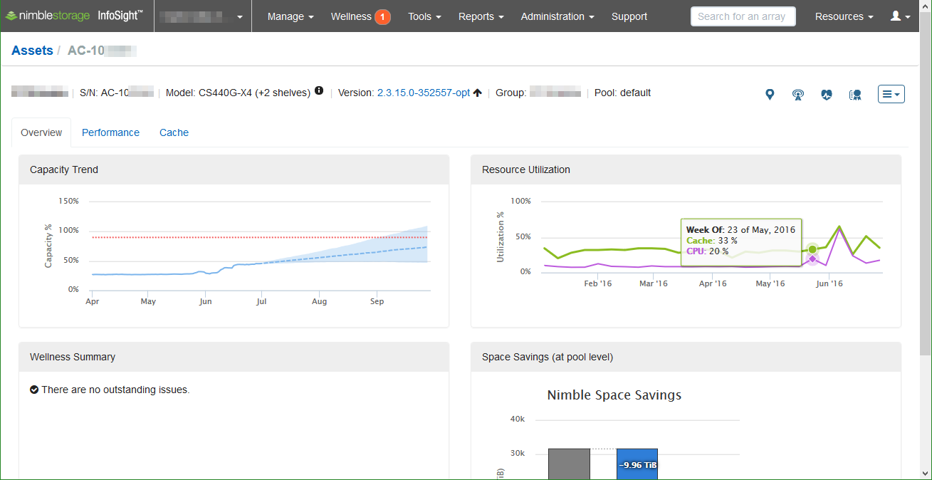
On the asset Overview page we also see the Wellness Summary for alerts, warnings, and informational notes on the status of the storage array. Additionally, we see the space savings observed from data reduction technologies.
Performance
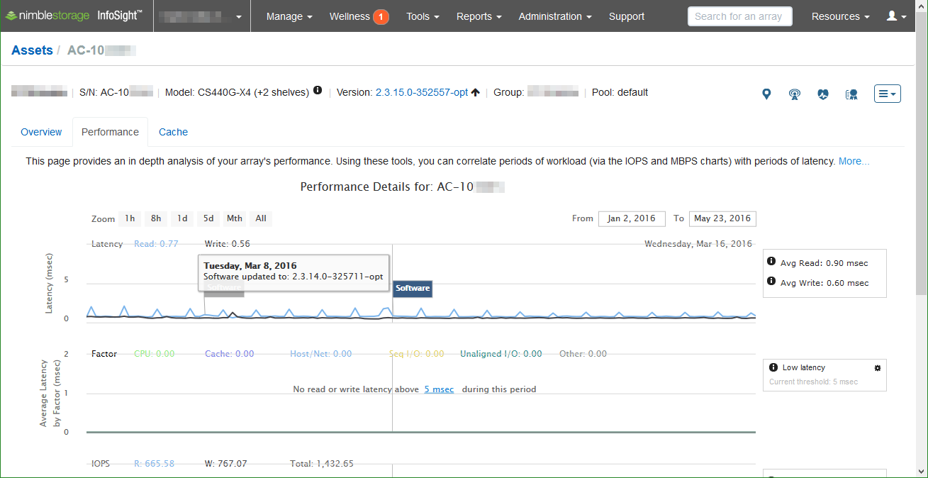
Selecting the Performance tab takes you to the historical graphs of performance, including latency, latency by factor, IOPS, and throughput. Click and drag on the charts to zoom in on specific points in time (timeline at the bottom also allows you to change the start and end dates for the graphs.)

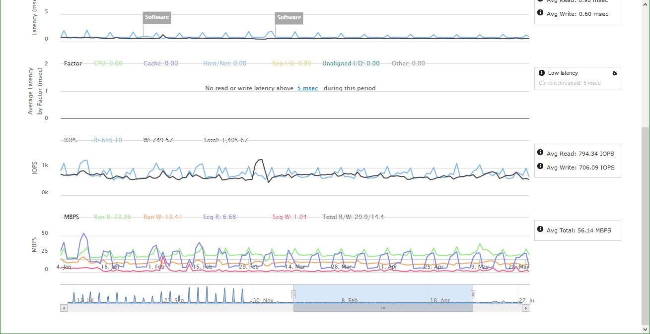
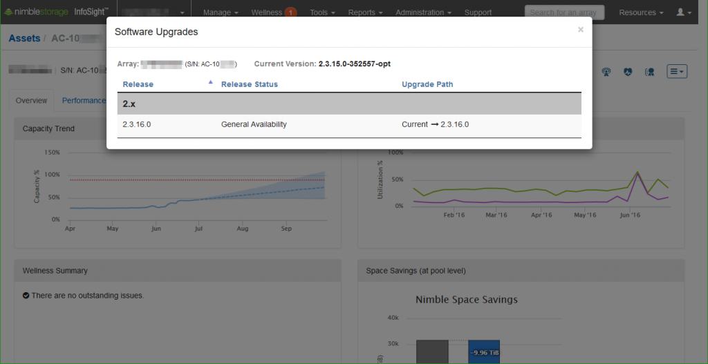
You may notice the Software flags in the latency (top) graph — there are also Hardware flags — and hovering the cursor over these flags provides details on the upgrade and the date it occurred.
I know someone’s marketing and sales departments will have a field day with this, but I wanted to show the value of these charts and this test was the easiest way. Full disclaimer, this array never observes this level of latency; a specific test was designed to trigger these result, so you would be able to see the detail that this chart presents.
| I deployed six Iometer and six SQLIO benchmark virtual machines, distributed across twelve host servers. The Iometer profile was configured as 70% read/30% write, 100% pseudo-random profile; the goal being to make it as difficult as possible for the spinning platters. I then built a new volume on the Nimble array and disabled the use of cache for only this new volume; this test volume was then presented to each benchmark virtual machine. All benchmark workloads were run simultaneously (and during an incremental backup of all virtual machine data due to the timing of the test.) |
From the test, we see that the primary factor was Sequential IO Contention. As a result of disabling cache usage, contention occurred on spindles without flash to accelerate random read requests. (More on how large of an impact the read cache is on Nimble Storage adaptive flash arrays to come later … predictive caching is amazingly accurate compared to the reactive caching that other storage arrays offer.)
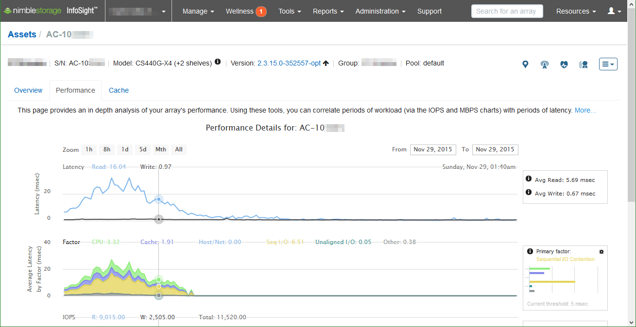
Move the cursor over the Average Latency by Factor graph to view the details at the top of the graph (in the top-right corner of the Latency graph, we can view the timestamp for the cursor position.)
The latency factors that InfoSight can monitor and decipher:
- CPU Saturation
- Cache Underprovisioning
- Host Network
- Sequential IO Contention
- Unaligned IO
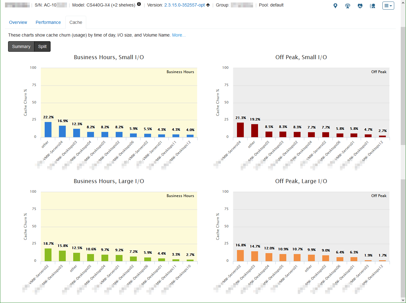
Cache Usage
The Cache tab provides us with insight into the cache utilization. I/O size as well as Business Hours and Off Peak hours break down the cache utilization (churn) graphs.

Selecting the Split menu item gives us cache usage by volume.
Volume Analysis
The Aggregated Volume chart compares Application Categories. The chart also compares volume data and snapshot data.
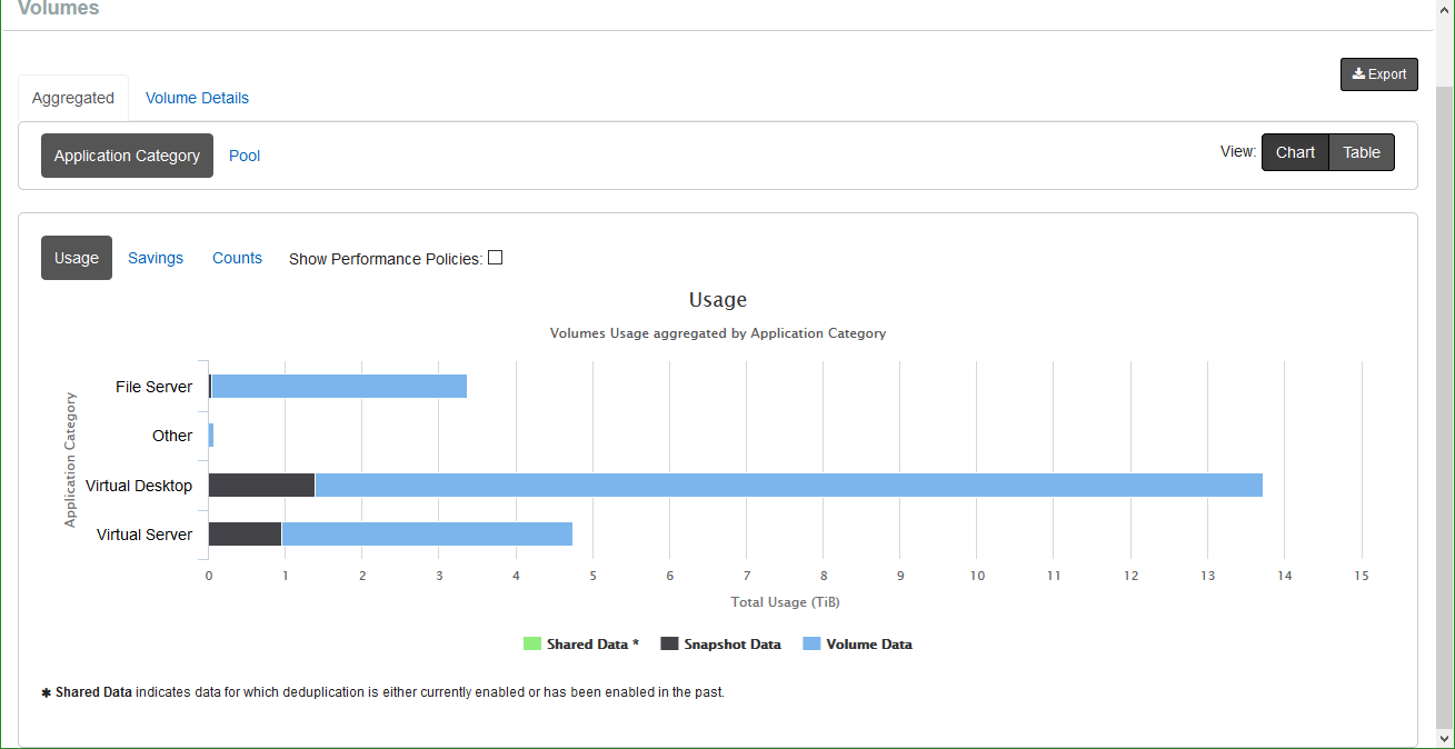
Selecting View: Table converts the chart into a table output.

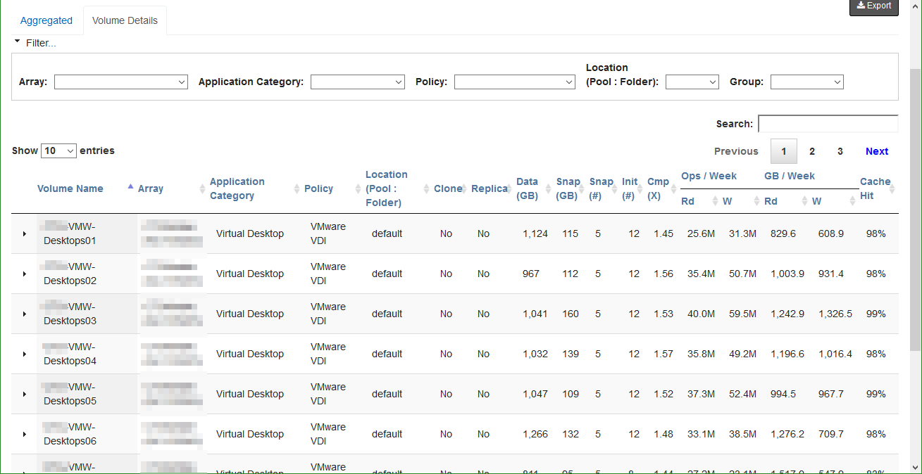
Selecting the Volume Details tab provides specifics on each volume along with filtering options. We observe, on a per-volume basis, the cache hit rate, operations per week, data reduction ratio, and capacity usage.
We will look at the Wellness, Reports, and Dashboard sections of InfoSight in part 2 of the Nimble Storage InfoSight Introduction.
Nimble Storage InfoSight Introduction Series
- Part 1: Overviews and Performance Analysis
- Part 2: Wellness, Dashboard, and Reports
- Part 3: VMVision


Well done. Why doesn’t everyone else publish such large screenshots?